30 October 2013

K I T C H E N . 1


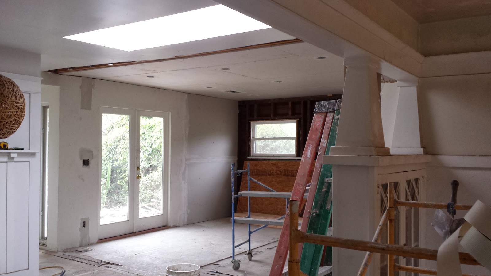
our remodel of the existing house couldn't begin until after after the completion of the addition for reasons i won't
go into. luckily, our contractor was willing to phase it this way even though it meant a much longer construction 
schedule. the original structure is just over 850 sf and was built in 1912. it was actually moved to the site a 
couple of years later and stands on what i would call a 'non-foundation' foundation. the ceiling joist/roof structure 
was in such bad shape, the roofing sub refused to go up there (some posts were literally tied with string). it 
would have been nice to open up the space to the underside of the roof since the ceilings sit low, just below 8'6",
but the time and expense involved wasn't something the owner wanted to deal with. understandably. 

we opened up the tiny kitchen by removing a second bedroom that was too small to be functional which made a 
drastic improvement in the space, bringing in light from the new doors and windows we installed facing the yard. 


01 October 2013

T R A N S I T I O N . 2


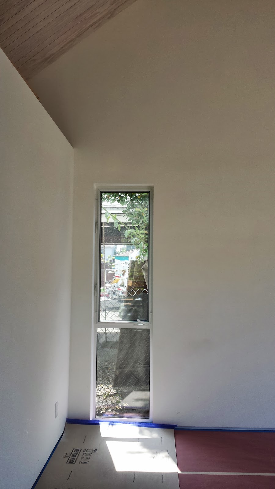
the ceiling of the existing house remains consistent throughout everything 'old' including at the new windows
meant to look original. at the first step of the transition to the new the ceiling drops several inches and remains
pinched until it rises again in the large garden hallway of the addition to reveal the underside of the roof. we
tucked a second bathroom into this transition space that can be used as a guest bath or as a bath for the
nursery bedroom. we also integrated open shelving for the kitchen and a linen closet with the controls for the
radiant heat in the space. adding the tall, narrow windows and making the stair wide enough to comfortably
lounge on, makes the space feel less like a hallway. the floor in the original kitchen is temporary for inspection
as is the stair to the backyard. the grey plaster will be covered in a grown surface from a black brick planter at
the base.


18 September 2013

B A T H . M A S T E R 1


i still don't love this tile, but the master bath is a beautifully bright and relaxing space despite its relative (to other 
master baths) compactness. the built-in closets that lead into it are finally being put in and the borrowed light 
from the bedroom into the space works exceptionally well. everything will be finished in a soft grey-brown walnut 
which will go well with both the tile and the finished concrete floor. we suspended all of the fixtures above the 
floor to make the space feel larger and to emphasize the high ceilings. the yet-to-be-installed mirror will have
hidden lights above and below.


17 August 2013

E N G A W A . I S H


although the design has no direct relationship to japanese architecture we looked at several examples of 
traditional japanese engawa and nure'en as a model for establishing a flexible threshold between the inside and 
out. the relationship between the 'house' and the 'garden' in traditional japanese architecture is complex and 
while we borrowed elements from it, in no way did we follow any set of rules. namely we took the idea of the 
floating or hovering volume with an attached covered porch (engawa or nure'en depending) that is seamless to 
the interior when the sliding walls (shoji) are open. typically, an engawa is a secondary threshold in a residence 
that serves as a veranda to a visual garden space. while our garden will be more habitable than visual, the 
engawa reads as part of the interior from the exterior and part of the exterior from the interior, effectively creating 
a blurred boundary between the two. we detailed the sliding glass doors in a way to create a seamless transition 
between the interior and exterior floor to emphasize this even more. the fascia of the metal roof and walls 
extends across this porch base to create a thickened graphic line around the entire form of the building, further 
connecting the enagawa to the interior while allowing it to be a seat, a ledge, a counter for the exterior garden 
'room'.*

*our drawings called for this punch to be deeper - a full foot deeper - but unfortunately the concrete footings were built and poured in the 
wrong place and we lost a foot. while the deeper ledge would make this indoor/outdoor relationship more apparent, the spatial concept is 
still there.


10 August 2013

M E T A L . D E T A I L S


yes, this metal is dirty, but the seaming and edges are absolutely perfect. we figured out the clip system with 
pat, which slightly varies in depth depending on facade and relation to the roof, in order to avoid all caps, gutters, 
and overlays. it looks like common sense, but getting seams and edges this clean and sharp is not easy - 
especially with our 1' fascia. pat executed everything flawlessly. even the horrid bathroom vent since we weren't 
allowed to vent out the back (he wants to amputate it).


03 August 2013

C S # 2 1


a completely independent conversation recently of the divergent formal strategies of establishing indoor-outdoor 
relationships deployed by the first wave of los angeles modernist architects (neutra, schindler, et al) and their 
counterparts versus the second wave (koenig, ain, etc) led to the google-ing of the koenig's bailey 
house (cs#21). 

this was the project we used in first-year to learn digital modelling and therefore the first project i really 
remember studying on a details level. maybe i am the only one who sees the similarities but it seems to have 
sunk in to my subconscious in a very direct way.